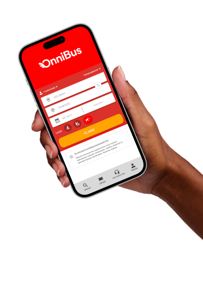
OnniBus
The goal of the project was to identify the main pain points in the booking journey and redesign the interface so that users receive the information they need at the right moment without interrupting the booking process.
Special attention was paid to decision-making moments, such as selecting additional options, reviewing travel information, and confirming the booking. The project explores how structural design decisions, information architecture, and interaction design can improve the user experience while respecting the limitations of the existing service.
01 //
My Role
- UX/UI design of the mobile application, with a particular focus on improving the user journey and making the booking process clearer
- Designing the key interface screens and interaction patterns, including the language selection flow, pop-up interactions, filtering solutions, and customer support screens that guide users throughout the booking process
- Creating an interactive prototype and participating in usability testing and design iteration together with the team
02 //
User Problem
A heuristic evaluation helped identify several usability issues within the booking process. A benchmark analysis complemented the research by showing how similar challenges are addressed in other services and helped identify opportunities for improving the interface. As a result, we focused on the following key issues:
- language selection
- accessibility
- information discoverability
These uncertainties often caused users to leave the application to search for additional information, interrupting the booking process.
03 //
User Persona
I created the complete user persona Mira, who travels with a dog.
The persona was based on identified user pain points, including uncertainty about pet travel rules, additional fees, and fear of making mistakes during ticket purchase.
Mira served as the primary design reference throughout the project and supported design decision-making.
Mira
34 • HR • Helsinki • Enjoys walking
Mira often travels to Tampere to visit family and friends. Previously, Mira traveled by car, but after a change in her life situation, she has switched to using public transportation. Mira often travels with her dog because it's not easy to arrange care for it.
Mira opens the OnniBus app. At the start, she wonders why the app's language can't be changed, even though she wants to use Finnish. Mira finds a suitable route and moves to the shopping cart. There, she sees a dog paw icon and, under "Select additional services," another paw icon with a euro symbol. Due to the unclear icons and text, Mira doesn't understand if the dog takes up more space on the bus and if she has to pay extra for it. She goes to the OnniBus website but doesn't find an answer there and ends up calling customer service. Finally, Mira returns to the app and makes a reservation, but the experience feels fragmented and uncertain because the information was scattered across different channels.
Questions During Booking
- Why can't the app's language be changed?
- Is there an extra charge for the dog or not?
- Does the dog take up "more space" on the bus?
- Why isn't all the necessary information available directly in the app?
04 //
User Journey
Before Improvements
- Open app — language unclear→
- Search Helsinki–Tampere→
- Unclear pet charges→
- Search the website→
- Call customer support→
- Return to book
After Improvements
- Open app→
- Change language→
- Filter for pets→
- Choose route→
- Select pet quantity and size→
- Book trip
05 //
Redesign Solutions
My design work focused on several concrete improvements to both the interface and the user journey:
- The placement of Customer Support in the bottom navigation bar
- Support screens as an additional support layer. These included informational and guidance screens intended to provide reassurance without interrupting the booking flow. The support screens offer contextual information and direct links to customer support at relevant stages of the booking process.
- The application’s language selection feature from scratch. The language settings were placed under the Profile section, making them easy to find alongside other application settings. This solution follows the structure of the existing OnniBus application while keeping navigation clear without requiring major structural changes
- The language change was designed as a step-by-step interaction: users select a language, confirm their choice, and see the application update through a loading screen.
I also designed several selection and pop-up screens supporting accessibility and special travel needs:
- pet quantity selection
- screen displaying the active pet filter
- dedicated pop-up explaining how a dog’s size affects pricing and travel rules
Accessibility requirements for wheelchair users were also addressed. I designed and implemented dedicated wheelchair selection screens positioned at the beginning of the booking flow before the search process. This allows users to see only accessible departures while receiving essential accessibility information at the right time.
06 //
Additional Design Decisions
I was responsible for maintaining the overall project structure and ensuring the design remained logical and understandable for the entire team.
During collaboration, I identified a point in the booking journey where reviewing information (bus stop list and accessibility details) and making decisions were combined within the same screen. I proposed an alternative overlay-based solution that separates information review from decision-making, reducing users’ cognitive load.
I also improved the shopping cart decision flow by visually separating two different actions. Proceed to Checkout remained the primary action, while Add Another Ticket was presented as a secondary option. This makes it easier for users to distinguish between completing the purchase and continuing the booking process.
07 //
Key Learnings
This project showed that uncertainty during the booking process is rarely caused by a single usability issue. Instead, it often results from multiple small gaps in information.
Reflecting on usability testing and the subsequent design iteration reinforced the importance of clear language selection and contextual support. The redesign aimed to help users find the information they needed within the booking flow, without having to leave it to search elsewhere.
08 //
Prototype
I implemented the solutions as interactive prototypes and ensured that the booking journey remained uninterrupted from launching the application to completing the ticket purchase.