OK Sananjalka
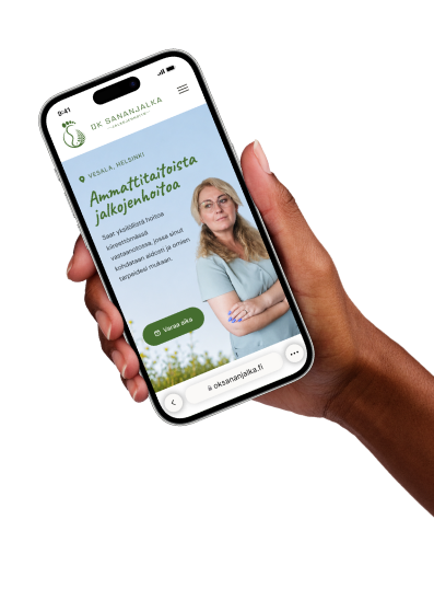
OK Sananjalka is a newly established foot care practice in Finland. The business needed its first website to introduce the specialist, explain available treatments, and provide an easy way for potential clients to get in touch or book an appointment.
Because the business was new, the website also needed to establish credibility, communicate professionalism, and create a strong first impression for future clients.
01 //
Project Goals
Business Goals
- Introduce potential clients to the available services
- Build trust by presenting the specialist and her expertise
- Provide convenient ways to contact and book an appointment
- Establish a professional online presence
- Support a successful business launch
User Goals
- Understand available treatments
- Choose the right service confidently
- Find contact and location information easily
- Book an appointment with minimal effort
02 //
Problem and Constraints
Choosing a foot care service is not always straightforward.
A potential client may not be familiar with professional terminology or understand which treatment is suitable for their specific needs.
At the same time, the website needed to present two groups of services: Palvelut (Main services) and Lisätoimenpiteet (additional treatments), with five options in each. The challenge was not simply to display all available procedures, but to organize the information so users could understand the offering and know where to start.
New clients may also have other questions:
- Which service is right for me?
- What will happen during my first appointment?
- Can I trust this professional?
- How do I find the reception and the correct entrance?
- How can I quickly book or contact the professional?
Location was another important challenge. The reception is located in connection with a private home, so providing an address alone was not enough. Users needed to understand in advance where to go once they arrived.
Constraints
This is a small independent business with a fixed budget and project scope.
The client works independently, so the website should not require complex technical maintenance.
The booking system was also not built from scratch. Appointment management is handled through the external Vello service, while the website directs users into the existing booking flow.
The potential audience includes older users, so particular attention was given to readability, clear navigation, sufficiently large interaction areas, and straightforward contact options.
03 //
Research and Information Architecture
The project began with exploratory desk research to understand the business context, foot care services, common booking patterns, and the questions potential clients may have before their first visit.
Since the business was new and had no existing customer data, I analyzed competitor websites, public customer reviews, online discussions, and booking platforms such as Timma and Vello.
The research focused on identifying:
- what builds trust before booking
- how users compare services, prices, and treatment durations
- what causes uncertainty when choosing a treatment
- what information first-time clients need
- how similar providers explain services, professional qualifications, booking, location, and practical visit information
The findings suggested that the website should do more than present business information. Its main role was to reduce uncertainty before the first visit and help users understand which service fits their needs.
Based on these findings, I organized the experience around a sequence of user questions:
Can this professional help me? → Which treatment should I choose? → What does it include? → How much does it cost and how long does it take? → What should I expect during the first visit? → Where is the practice and how do I get there? → How do I book?
Main User Journey
Discover the services → choose a suitable treatment → understand what to expect → learn about the professional → see the environment → get practical information → book an appointment
The information architecture and service content were built around this journey, with particular emphasis on clear service differentiation, visible pricing and duration, trust-building information, first-visit guidance, and easy access to booking.
- Header
- Hero Section
- Services Section
- First Visit Section
- About Oksana
- Gallery Section
- Contact / CTA
- Location Section
- Contact Details
- FAQ Section
- Footer
- Header
- Hero Section
- Sticky Bottom ButtonsBook / Call — Varaa aika / Soita
- Services Section
- First Visit Section
- About Oksana Section
- Gallery Section
- Contact BannerCTA / highlights
- Location Section
- Contact Details
- FAQ Section
- Footer
04 //
Design Decisions
Helping Users Choose a Service
One of the main UX challenges was presenting treatments in a way that did not require users to already understand professional terminology.
The services are divided into two categories:
Palvelut — main services
Lisätoimenpiteet — additional treatments
This creates a clearer hierarchy between the two types of services instead of presenting all ten options as a single undifferentiated list.
Each group contains five services in a horizontally scrollable carousel.
For the main services, the card does more than display a name and price. It helps answer a more useful question:
“Is this service suitable for me?”
Each main service card includes:
- service name
- situations in which the service may be suitable
- price
- approximate duration
- booking option
- access to additional information
This allows users to compare the main services based on their own situation rather than relying only on professional service names.
Details Without Losing Context
Selecting Lue lisää (Read more) opens a modal with more detailed information.
I chose not to create a separate page for each service. Users can review the details, close the modal, and continue comparing services from the same place.
Reducing Uncertainty Before the Visit
There were two moments in the journey where new clients particularly needed additional information: the first appointment and arriving at an unfamiliar place.
First Visit
For new clients, I created a dedicated Ensimmäinen käynti / Mitä odottaa? (First visit) section.
It explains the first visit as a simple sequence: initial information, discussion about the condition of the feet, examination, and an individual care plan.
The section also explains that clients do not need to feel embarrassed about the condition of their feet.
The purpose is not only to provide information, but also to make the first appointment feel more predictable before booking.
Finding the Reception
Because the reception is connected to a private home, I decided not to rely on the address alone.
The location information was designed as a small arrival flow:
Address → Google Maps → Parking → Entrance
By selecting Katso sisäänkäynti (View entrance), users can open a visual guide.
It uses photographs and short descriptions to help identify the gate and the correct entrance.
On desktop, the photographs can be compared side by side. On mobile, the guide becomes a vertical sequence so the images remain large enough to recognize easily.
Both solutions address the same goal: give users the information they need before they have to ask the professional directly.
Responsive Design and Action Strategy
The mobile experience was not designed as a smaller version of desktop.
The information hierarchy remains consistent, but interaction changes depending on the device.
Desktop
A wider screen allows related information to appear together and makes better use of horizontal space.
The main navigation remains accessible, while quick contact is available through a separate floating control.
Mobile
Content becomes more sequential, navigation turns into a full-screen menu.
At the same time, I avoided placing several competing CTAs directly in the Hero section.
Varaa aika (Book) remains the primary action on the first screen.
Once the user starts scrolling and the Hero CTA moves out of view, a sticky bottom bar appears with two actions:
Varaa aika — Book
Soita — Call
This keeps the main actions accessible while browsing without overloading the first screen.
CTA Hierarchy
- Varaa aika (Book) — Primary booking action
- Soita (Call) / WhatsApp — Direct contact with the professional
- Lue lisää (Read more) / Katso sisäänkäynti (View entrance) — Contextual information
- Google Maps — Transition into an external navigation context
05 //
Usability Testing and Iteration
Before launch, I conducted usability testing with 5 participants.
Testing took place at different stages. Some participants used the Figma prototype, while others tested the later Framer implementation.
I observed whether users could:
- understand what services were available
- find information about the treatments
- navigate between sections
- find booking and contact options
- understand the first-visit information
- find practical information about the location
Observation
Some participants relied heavily on navigation and did not always naturally continue exploring further down the page.
This suggested that some users needed a clearer visual cue that more content was available further down the page.
Design Response
I added a scroll progress indicator that gives users an additional visual signal of their position on the page.
Not Every Comment Requires a Design Change
Usability testing also produced subjective comments about visual details.
I separated issues that affected understanding or task completion from individual preferences and limitations of the prototype itself.
06 //
From Figma to a Working Website
The project did not end after the design files were completed.
I independently implemented the responsive desktop and mobile versions of the website in Framer.
The website includes:
- service detail modals
- visual entrance instructions
- gallery lightbox
- FAQ accordion
- mobile navigation
- scroll-dependent interactions
- sticky and floating contact controls
- phone and WhatsApp contact options
- Google Maps navigation link
- links to the Vello booking system
Some interactions required custom code components and overrides.
AI-Assisted Coding
I used ChatGPT as a coding assistant while working with custom Framer code.
I defined the required interaction behavior, described the component requirements, integrated the code into Framer, and tested it directly within the website.
If a component behaved incorrectly or produced inconsistent results in certain conditions, I returned to the implementation, iterated, and tested again.
In this process, AI was used as an implementation tool, while the UX logic, integration, testing, and design decisions remained part of my work.
07 //
QA and Final Product
Implementing the website revealed issues that could not be identified in Figma alone.
Before launch, I tested the website on desktop and mobile, as well as in Safari and Chrome.
The QA process included:
- responsive behaviour
- navigation anchors
- modals
- sticky and floating elements
- gallery interactions
- external links
- phone and WhatsApp actions
- scrolling behaviour
- viewport behaviour
Some issues appeared only in specific browsers.
For example, sticky elements and the mobile viewport could behave differently in Safari and Chrome and required additional adjustments.
This stage changed how I think about responsive design: real browser and device behavior became part of the design process rather than only a final technical check.
08 //
Outcome and Learnings
Outcome
The result is a responsive website that supports the customer journey from first discovering the services to booking an appointment.
It works as more than a digital business card and helps potential clients:
- understand the available services
- decide where to start
- know what to expect during the first visit
- become familiar with the professional and the environment
- understand how to find the reception
- easily book or get in touch
What I Learned
One of my main takeaways is that improving the user experience does not always require adding more functionality.
In this project, many important UX decisions were about reducing uncertainty: helping users understand the services, explaining the first visit, showing the correct entrance, and keeping important actions available at the right moment.
Usability testing also showed the difference between how a designer expects users to interact with an interface and how people actually behave while completing a task.
Implementing the website independently in Framer added another layer to the process. Responsive design had to be tested not only in the design environment, but also across different browsers and real devices.
The project gave me experience across the full cycle:
- Research→
- IA→
- UX/UI→
- Testing→
- Iteration→
- Implementation→
- QA→
- Launch